
The Importance of Thumbnail Sketches
Here's why you should be planning out your comics pages with thumbnails.

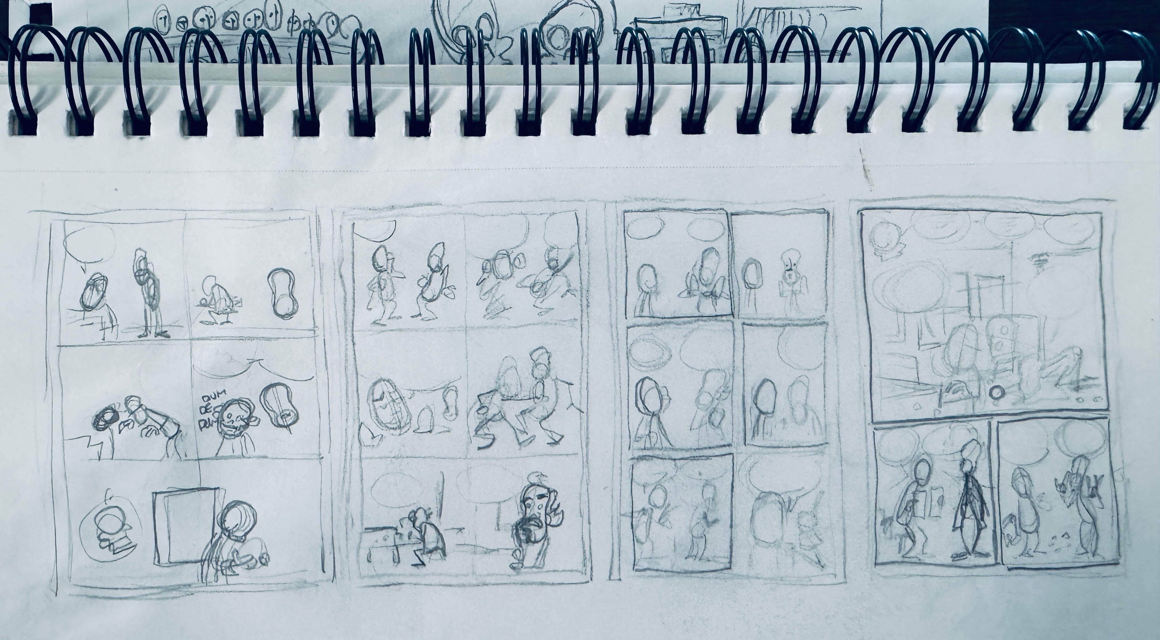
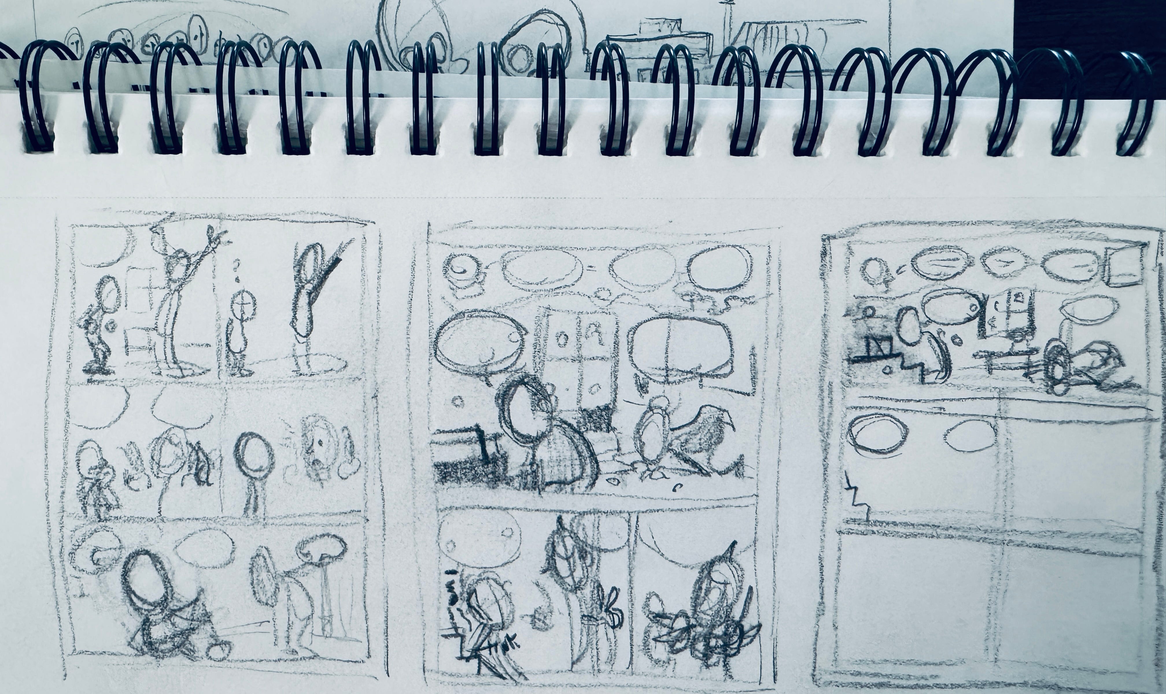
Thumbnails are small sketches of comics panels or pages that help you in the plan out your work. It remains small so that you can focus on the layout and ignore minor details like expressions and background details. Some people use them to work on value as well. The key is you stay small (hence the name). Faces aren’t fully rendered, and poses might not be either. You are just planning where everything will go. And if you don’t like what you’ve drawn, you can easily start over because you haven’t invested much time. Here’s some recent thumbnails I did for my WIP graphic novel.
However, for the past few years I skipped the thumbnail stage. I was working entirely digitally, and thumbnails seemed like an unnecessary step. Why not draw thumbnails right on the canvas? I could always reduce the size and do them on the canvas that would eventually be the final. Wouldn’t that save time?
Well, yes. Maybe. But thumbnails are very valuable, as I am reminding myself currently as I’m back to doing them. Here’s why I like them:
I have to draw everything over.
When I do thumbnails I do something that resembles the size of the page I’m working on, but not exactly. Things won’t quite line up if I were to blow up the thumbnail to print size. But measuring everything out defeats the purpose of making it quick. It’s close enough, but I’ll have to fiddle with it once I move to paper.
I find that doing thumbnails on a digital canvas locks things in too quickly. I am always more likely to try to make something work rather than start from scratch, which is in some cases exactly what I need to do.
I can see the whole page right from the start.
One of the problem with digital is that it can be like looking through a very small window—I rarely see the whole page at once. (This is another reason why I started doing rough drafts on paper again). With thumbnails I can not only see the entire page but a succession of pages too.
Drawing tiny is fun.
There’s a lack of mistakes with thumbnails that I find freeing. You aren’t going to screw up perspective, for instance. This lack of attention to detail brings the joy.
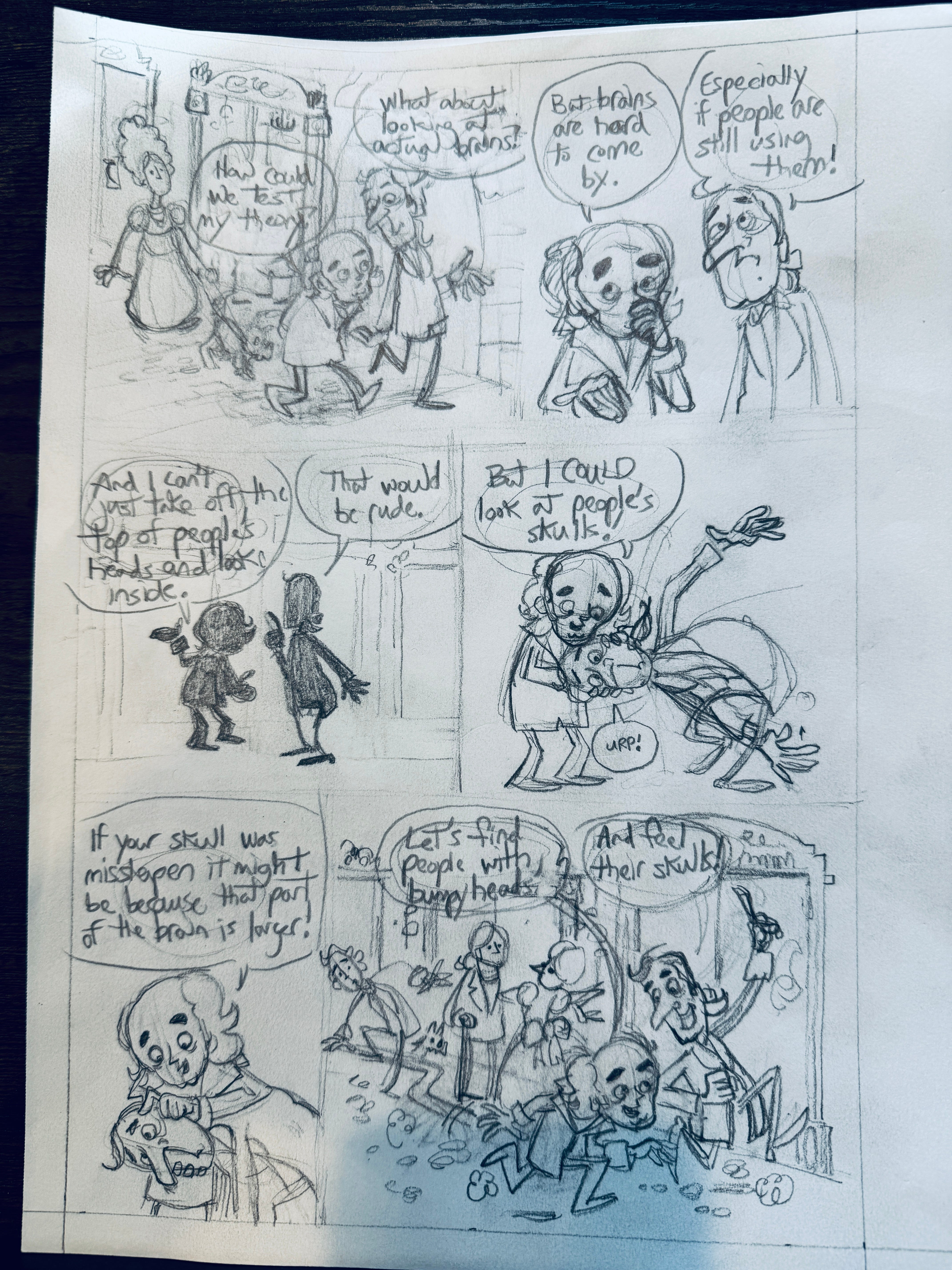
So here’s how I use thumbnails. In this case I’m working from a script, so I know what the dialogue will be. I just need to place it on the page.
This thumbnail is about 3 1/2 inches tall. I can’t write small enough to put words in the thumbnails, but I can indicate where the words will go.
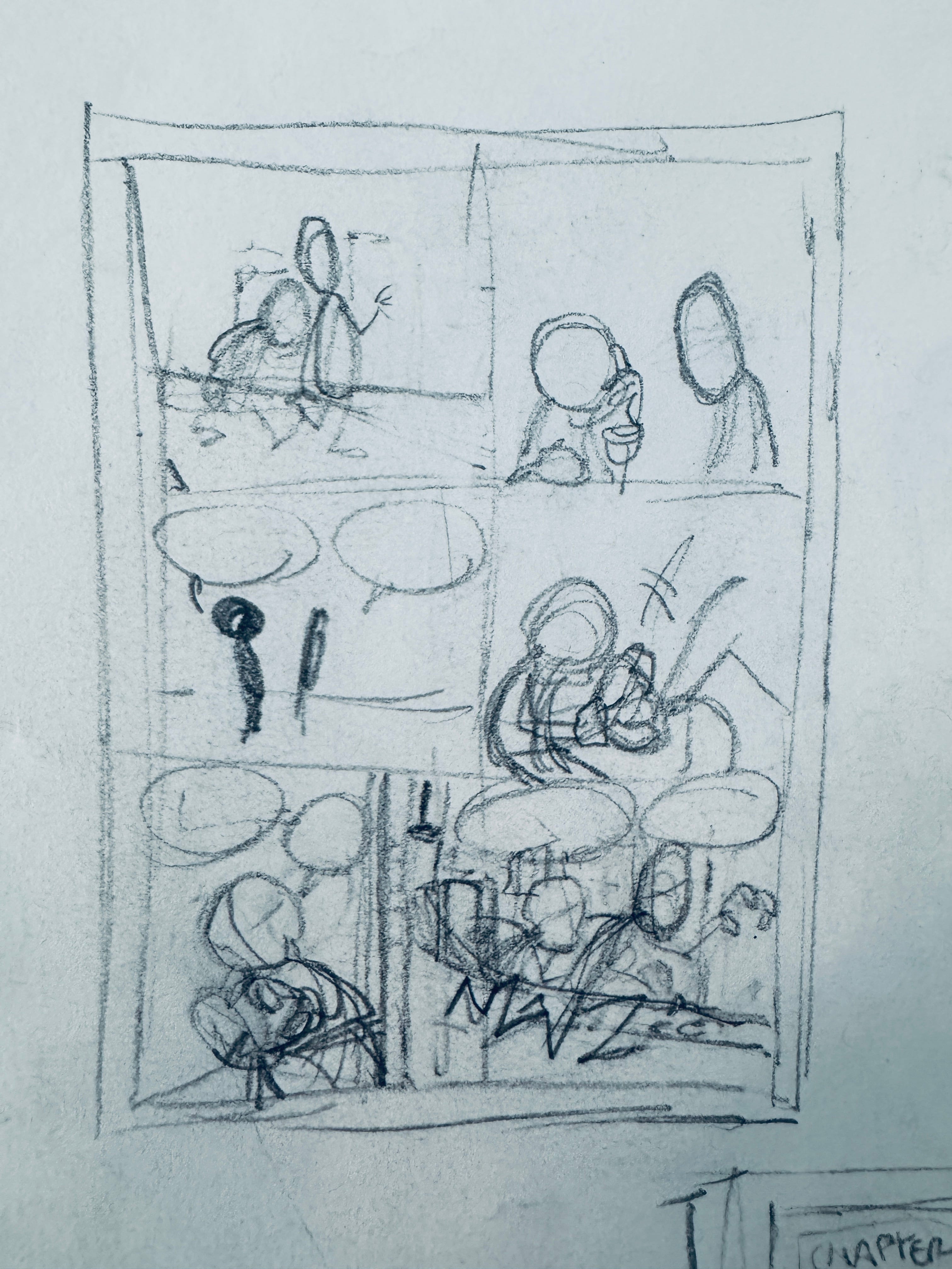
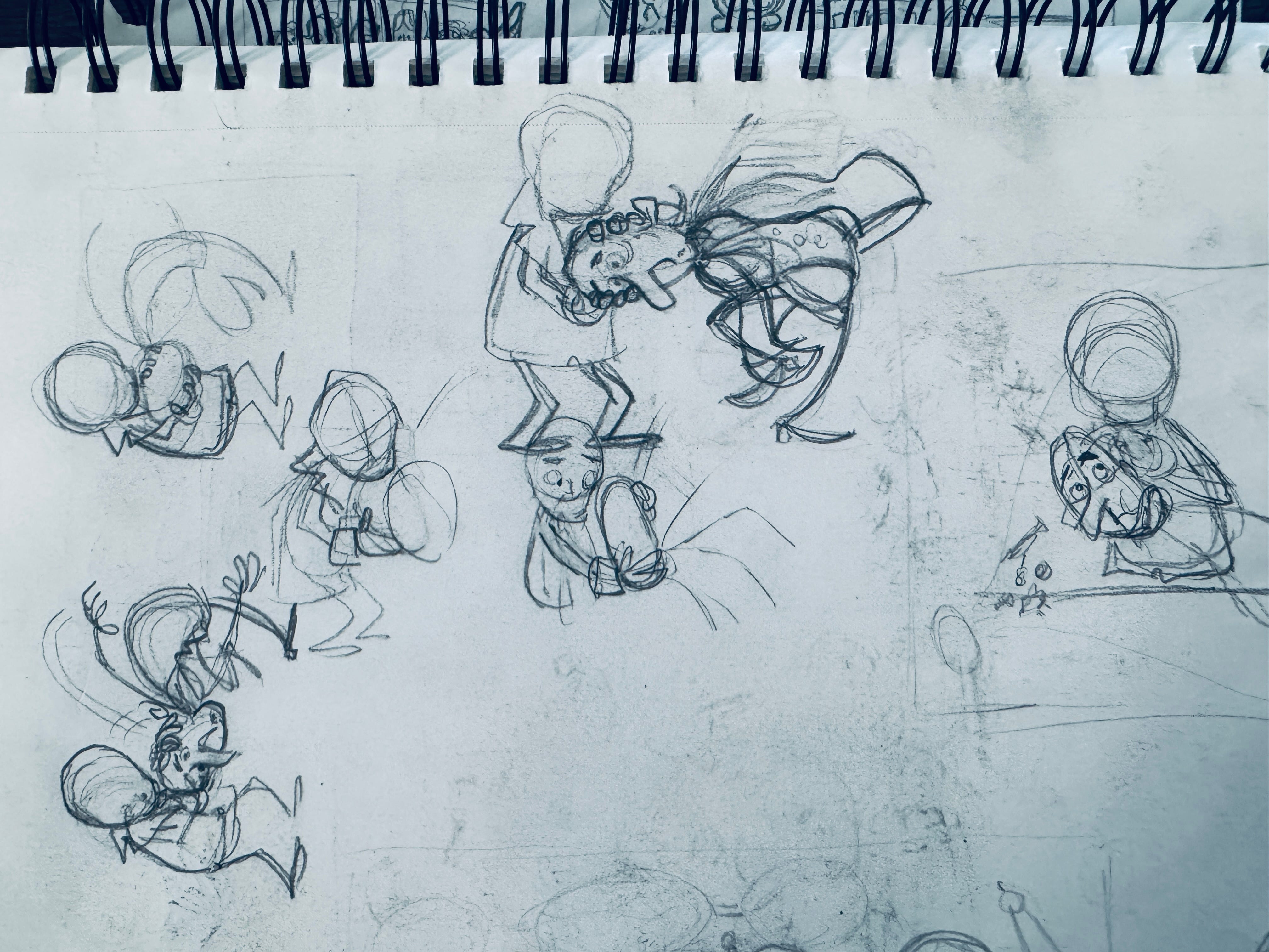
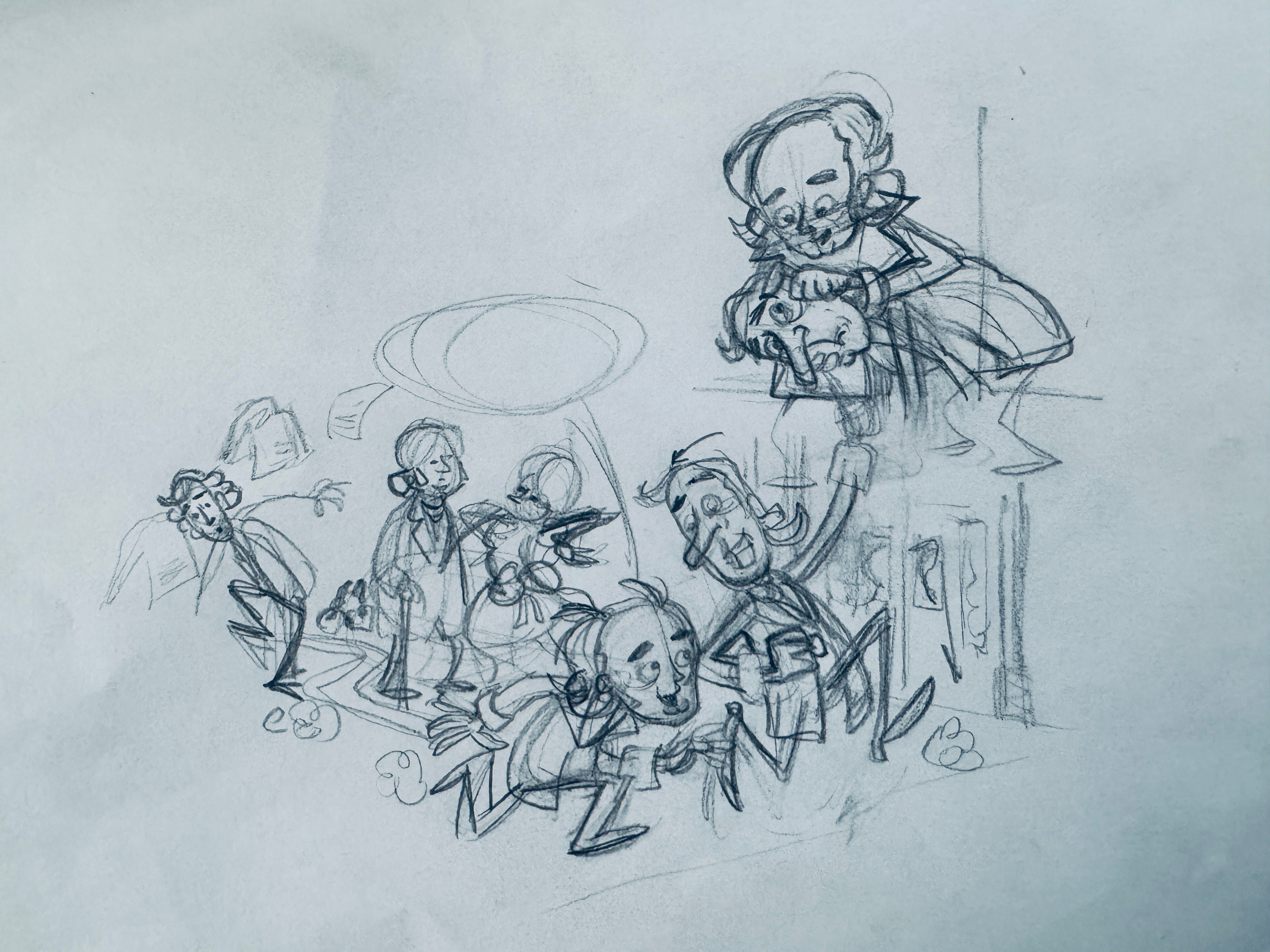
Then, I’ll draw some sketches of the characters in each panel so I can work through any problems I might have before I start working on paper. For example, in the street scene I wanted to make sure my perspective was correct, and I wanted to add people milling about.
You can see I had some trouble working out how Gall pulls Spurzheim’s head down. You’ll also see that in some cases I’ll draw the full body even though it won’t go in the panel. I’m making sure the pose works.
Finally, I go to work on the final page. Don’t do what I did and put the artwork on before the text. Text always goes first so you don’t run out of room! However, I’m going to ink it digitally, so I can move stuff around and resize it in Procreate before I do that. Plus, I know the text I put in is too big anyway.
As always, if you have any questions, let me know! I’m curious how other people use thumbnails (if they do) and how they go about integrating them into their workflow.
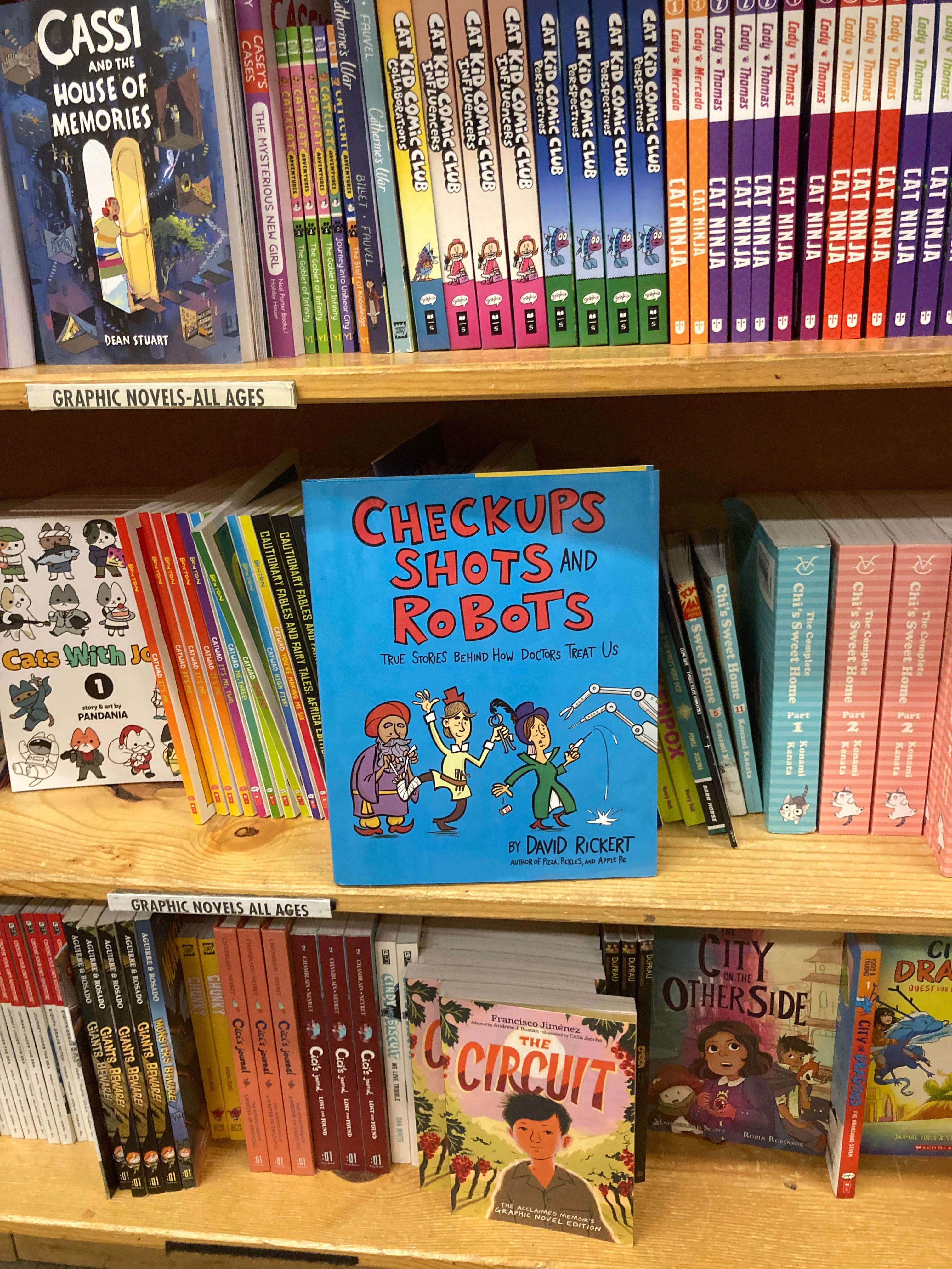
And don’t forget that my two graphic novels, Pizza, Pickles, and Apple Pie and Checkups, Shots and Robots are available! Here’s a shot of my second book at Powell’s in Oregon. My dad is there for my cousin’s wedding, and is always on the hunt for it wherever he goes.
This hybrid approach is the best of both worlds. I’m going to tag this post and reference it in one of my future newsletters. Good job!