
Using Color Palettes
Color palettes are essential to doing comics work. Here are some tips on using them.

I hate coloring my comics. I find it tedious and boring. Plus, it doesn’t come naturally to me. It’s my least favorite part of the process, one I’m hoping to outsource in the future.
However, while I’m still doing it myself, I’ve found a couple of tip to make it less of a chore. One is to have a good podcast series or audiobook to listen to as you work (I will sheepishly admit that I listened to Britney Spears’s autobiography while coloring Checkups, Shots, and Robots. But it passed the time).
Another is to use a color palette. The benefit of color palettes is threefold. For one, it limits the colors you use, and therefore the possible choices of colors you have to work with, so you aren’t choosing colors from scratch every time. It also provides a unifying element to your work. And finally, it can set the mood for the book you are working on.
And fortunately, you don’t have to design palettes yourself. There are plenty of Photoshop and Procreate palettes out there for you to use for free. In fact, that’s what I do for both of my first two graphic novels, Pizza, Pickles, and Apple Pie and Checkups, Shots, and Robots. Here’s the palette I used:
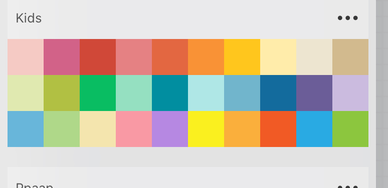
I forget where I found it, but I’m pretty sure I googled “children’s book palettes” and found this one. It’s 30 colors, which is about all you want to work with. Anything more than that and you have too many choices. However, I did borrow a few of the greys and browns from this palette, which was the one I initially started with.

Here’s a page from Checkups, Shots, and Robots to show you the palette in action.

.The other palette I have is for skin tones. As you can see above, it’s rare that I only have one skin tone on a page, and I have a bunch preselected for me to use. I highly recommend having a palette like this.

Here’s how a new color palette can change the feel of a project. For a new idea I’m working on, I started to color the first page using the palette from the first two books.

I works ok. But it just didn’t feel right for a scene with a bunch of guys opening a grave. I started to mess around with filters and got here:

This felt better, but it was a little washed out. Besides, I didn’t want to have to use a filter every time I needed a palette.
Then my friend told me about the Zorn palette, a popular palette that uses very few blues. If you search for it, you’ll find lots of artwork created using it.
Sure enough, I was able to find free Zorn palettes for Procreate online:
Despite my initial discomfort, this was the magic I needed. Here is the new colored image:

I cheated a little bit with some of the colors. I wanted to highlight the leaves in the trees (although I think some Zorn palette colors might work just as wel) and I really wanted to highlight the smell coming out of the coffin so I used the bright yellow. One of the benefits of using a limited palette is that if you want to highlight a certain color you can - just grab one outside the palette. However, I haven’t looked at this for a while, and now I wonder if maybe I would be better off sticking with the Zorn. We’ll see.
Of course, there’s a possibility that a publisher might not like this palette at all. And - finger crossed - they might ask someone else to do it. But in the meantime, this palette gives me a place to start, and more importantly it gives this a certain feel that the first coloring endeavor lacked.
One more way to get color palettes is to generate them from an image. You’ll see this option in Procreate when you click on the plus sign in the palette window.

You can load an image or a painting with a color scheme you like and it will generate a palette form that. I think Procreate limits it to 30 colors automatically. You can do the same thing in Photoshop, but it gives you more options for how many swatches it will create.
I have done this before, but not had much success with it. I get a good palette, but somehow it never quite captures the magic of the original I like so well. But give it a try!
Palettes don’t make me like coloring more, but they od make the task easier and make me feel like I know what I’m doing.
If you want a great look at how I use palettes, be sure to check out my graphic novel Checkups, Shots, and Robots.

Skin tone palettes. Of course. Brilliant. Thanks for sharing these details.
This is so helpful! I especially love your before, before again, and after examples!